All the Colors of Prang
“Let us take good care of the colors. Let them enjoy the color, – they will handle it with care, because of their pleasure in it.”– Louis Prang (Prang 1893)
Louis Prang is known as an artist, innovator and successful businessman who profoundly influenced the landscape of art education, the print industry and color theory. Prior to this class and project, I did not know much about Prang and his influences on the modern-day classroom. I think it was because I had not made the mental connection of his name to influences, educational tools and the color wheel. However, the name rand a bell because of the reading in our class and I saw some of his products in an art class I had substituted for recently. The purpose of this Indie Research project is to learn more about Louis Prang’s life, achievements, and influences on modern-day art classes.
Louis Prang was born on March 24,1824 in Prussia, which is modern-day Poland. A majority of his influence in the print industry was attributed to his father, Jonas Louis Prang, who owned a print and textile workshop. Through his apprenticeship, Prang learned both about business and print processes such as dyeing, engraving, and calico printing. He travelled Europe as a journeyman in which he met his first wife, Rosa Gerber. However, due to the German Revolution, Prang fled his homeland to New York and then migrated to Boston.
In Boston, he continued to work in the printing industry and excelled. He supported himself and his wife by making wood engravings for publishers. He learned lithography from his protégé, Julius Mayer, and together they started Prang & Mayer in 1856. The company focused on producing business cards, announcements, prints of Civil War maps and portraits, albums and collectible business cards of floral arrangements and Christmas cards. His wife influenced many of the designs because of her affinity for flowers. In 1860, Prang bought out Mayer and changed the name to L. Prang & Company. He had offices around the world in London, Boston, Chicago, New York, South America, Australia, and India.
In 1864, Prang and his family travelled back to Europe so he can study different European print processes and recruit artists to relocate for his company. Upon his return to the United States, he began to produce chromolithographs of landscapes. Chromolithography, a technique created in Germany during 1800’s, is a chemical process where an image is applied on stone, zinc or aluminum surfaces. Due to the repulsion properties of grease and water, they were used to block certain areas of the print. Each stone would be prepared with specific colors of ink so the final proof could be repeated for printing multiple copies of an image. The stone would pass through a press thus creating a product that revolutionized commercial printing because it could create more prints unlike metal etchings. Prang utilized this process to create Christmas cards, which resulted in him earning the moniker, “Father of Christmas Cards” due to its’ massive success in both Europe and the United States during the 1870s. Furthermore, Prang began publishing drawing and art textbooks for elementary public schools. The success and growth in business sales and publishing production of educational products led to the creation of a subsidiary enterprise, the Prang Educational Company.
Between 1881 and 1900, Prang experience many changes in business and his personal life. The company had endured a merger, changed its’ name to the Taber- Prang Company and published educational textbooks, tools, journals and printed artwork and articles of contemporary artists and educators. Also, the corporation moved from Boston, Massachusetts to Springfield, Massachusetts. During this time, Prang worked with two prominent art educators, Walter Smith and John S. Clark. Prang published Walter Smith’s textbooks that advocated the South Kensington approach but believed Smith’s works should be curtailed to meet the needs of contemporary art studies. Prang and Smith professionally separated. Smith returned to Europe and Prang continued to edit and publish his works. Prang turned to John S. Clark to work together on the subject of color theory, thus the Prang color system was created. It consists on 12 units of colors organized in different levels that can be crossed with each other to create different colors and are organized in a pattern of a wheel. Primary Colors are blue, yellow, and red. Secondary colors (also know as Intermediary), which are purple, green and orange. Tertiary colors are red-orange, yellow-orange, red-purple, blue-purple, yellow-green, and blue-green). By 1898, his wife, Rosa, passed away and he remarried an art teacher and author associated with the Prang Educational Company, Mary Dana Hicks.
Prior to their marriage, Prang, Hicks and Josephine Locke, a staff member, wrote The Prang Primary Course in Art Education Suggestions for Use of Form Study, Drawing and Color in Relation to Art Education and also in Their Relation to General Education in Primary Schoolsin 1893. The textbook discusses form drawing, activities, materials, and techniques. It consists of 36 chapters with each chapter focusing on lesson plans for each school week for teacher’s to utilize. Each chapter builds off of the previous lesson paying particular attention to drawing forms focused on the sphere, cube, cylinder, ellipsoid, etc., modeling with clay, paper folding, tablet arrangements, and the study of color in nature. Prang’s encouraged teachers to allow students to be receptive and expressive by asking questions that are thought-provoking such as ”How much can you see of the sphere? Have you ever made a cube? How much can you remember about a cylinder?” Also, Prang’s lesson plans were age appropriate especially in regards to color. He created curriculum that allow students to arrange colored tablets in different arrangements and patterns to understand the relation between colors and to discuss their choices in artwork. The children were encouraged to name the colors, see how many colors they know, group the colors (i.e. warm or cool), and see the difference between different values within a color on a scale. Some of the color exercises consisted of cutting up different colored papers in different shapes and placing them next to each other to give a comparison of how colors can change in relation to space, shape and shadow. For example, Prang discusses shapes of cube and prisms with tones of red, orange, and yellow.
Prang understood the influence of nature and genetics on art education. He encouraged the study of art in nature. However, he acknowledged there is a difference between color in nature and color pigments in art. The spectrum of colors in nature and in art never seem to be quite the same. Despite the discrepancy, Prang encouraged studying nature as an important component to have a well-rounded art education. As per genetics, Prang theorized that each person perceived color differently. His wife, Mary Dana Hicks Prang, conducted studies that confirmed his theory through child studies conducted with students from different ethnicities attending separate schools in unrelated cities and states. She concluded there were slight differences and attempted to incorporate her findings into the new art education curriculum. At this time, Prang stepped down from managing the company and decided travelling to promote his educational tools was his passion. Unfortunately, Prang passed away from pneumonia during a marketing trip to California in 1909.
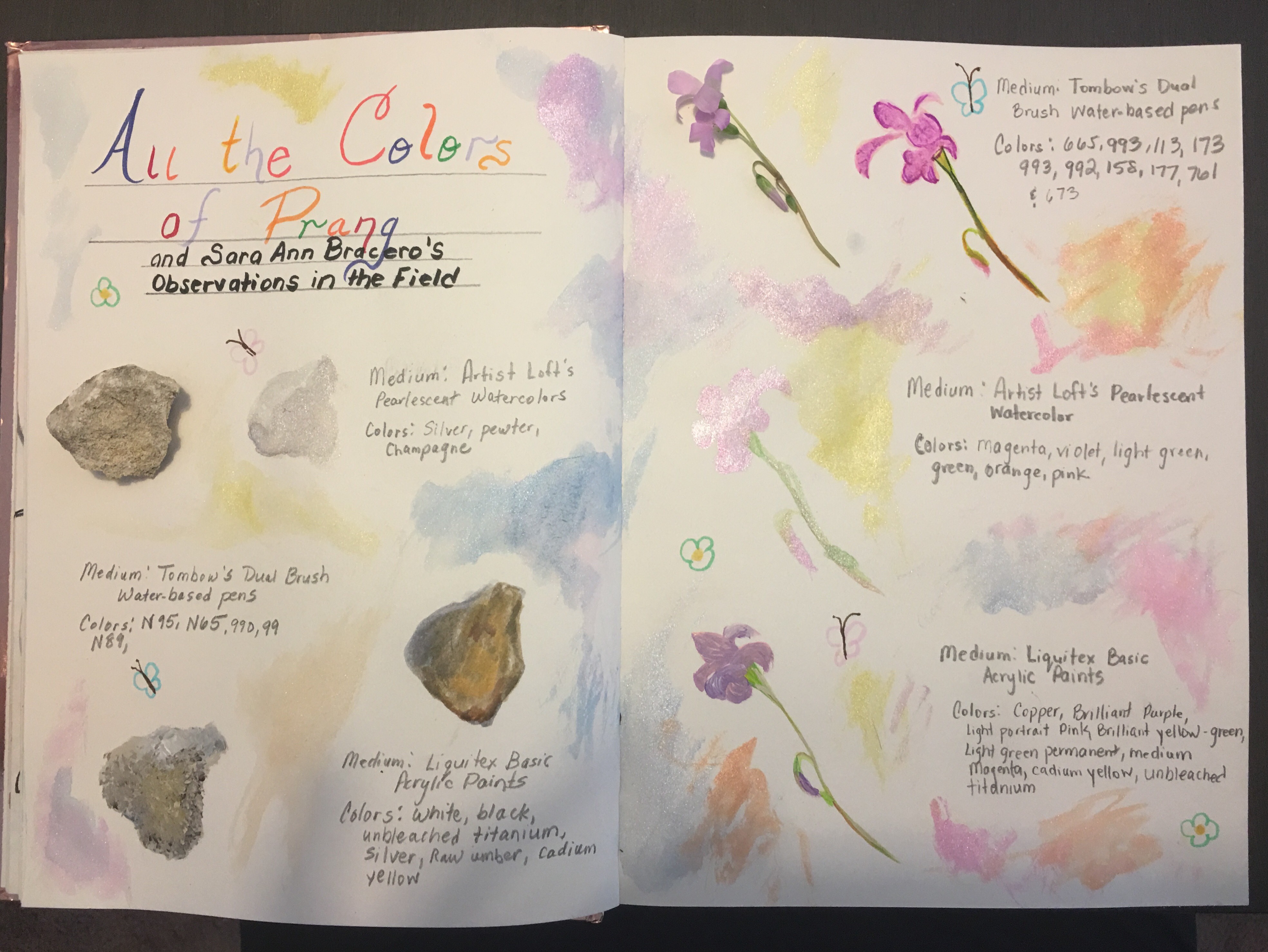
To further help understand Prang’s practices, I decided to base the art project component on studying nature and recreating objects found in through various mediums. I desired to test Prang’s theory on the difference between color in nature and color pigments in art materials. My hypothesis is that there will be differences depending on the subject and various mediums. Some mediums can emulate real objects with subtle differences due to pigment saturation, pigment binders and techniques. The variables are products available to the artist and level of artist’s mastery of mediums. My son and I went foraging in our back yard to find specimens, which were a rock, small flower, twigs and two contrasting leaves. The materials used are Liquitex basic acrylic paints, Artist’s Loft pearlescent watercolor set and Timbow’s water-based brush pens sets (Primary, Secondary, Landscape, Pastel). The specimenswere placed on the top left corner and each drawing/ painting were sketched to the objects’ left. Please note the real leaves are above the sketches. Also, each drawing/ painting is labeled with which medium and colors were used. The results of this experiment are above.
In conclusion, I do agree with Prang’s theory that colors in nature is different from man-made pigments. However, I concur it also depends on materials available in the market, pigment saturation and binders in each medium, and the level of artists’ mastery of techniques and art supplies. There are more available art supplies today are not the same as the materials Prang and students used in the late 1800s and early 1900s. The supplies used in this experiment were not available during the time and these products are mass-produced for the public. Whereas, many preceding artists made many of their own supplies, which gave them the advantage of creating a color palette that was closer to their needs for a specific artwork. I further believe the object and medium used had an impact on the outcome of the experiment. I found Liquitex basic acrylic paints were more successful in copying the rock and flower specimens. Timbow’s water-based brush pens were productive in reproducing the twigs. Artist’s Loft pearlescent watercolor set recreated the brown leaf as realistic as possible. However, I found it difficult to emulate the green leaf with either medium.

I have thoroughly enjoyed this project because it helped me not only learn about Louis Prang and his influences in art education. It helped furthered my knowledge in understanding art and my love of colors. I do believe colors are based on perception and it is natural for us as humans to try to understand the world around us so we name everything. I feel as a kindred spirit with Louis Prang because he utilized art as a tool to help each of us understand the information we from the world we live in and in turn express our thoughts to each other through the arts. As an educator, I will utilize his methods, theories and educational tools where appropriate in future classes.
References
Hicks, Mary Dana and Locke, Josephine, The Prang primary course in art education suggestions for use of form study, Drawing and color in relation to art education and also in their relation to general education in primary schools. The Prang Educational Company: 1893. Boston, Massachusetts.
Masten, April F. (2018). Re: New England Historical Society: Louis Prang Invents the Christmas Card in Boston. [Online Forum]. Retrieved from http://www.newenglandhistoricalsociety.com/louis-prang-invents-american-christmas-card-boston/
Prang, Louis, Prang’s Civil War Pictures, The Complete Battle Chromos of Louis Prang. Fordham University Press: 2001. New York, New York.
“Prang’s Chromo: A Journal of Popular Art”, 1868-1870.
Stankiewics, Mary Ann. Roots of Art Education Practice. Art Education in Practice Series. Davis Publications: 2001. Worchester, Massachusetts.
_________________________________________________
